Design System for Semiconductor Factory

Background
This is the inspection machine used in the factory. It checks finished semiconductor products.
The software connected to the machine helps operators review inspection images, results, and settings.
There were three main types of inspection software.
Goal
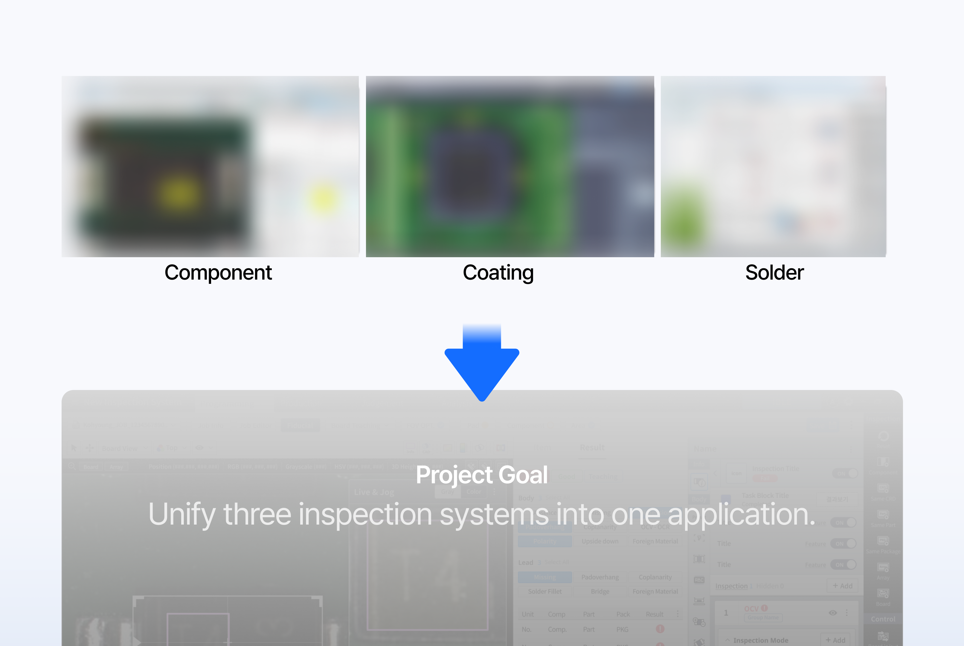
The inspection purposes were different, but the user workflow was similar. Users viewed an image, checked an inspection result, and changed settings.
However, each product had developed a different UI for the same type of work. Our goal was to bring the three inspection systems into one application
Problem
This Fragmentation created two main problems.
For users, the problem was Usability For the product team, the problem was Scalability
❶ Usability Problem
<Unstructured Settings>
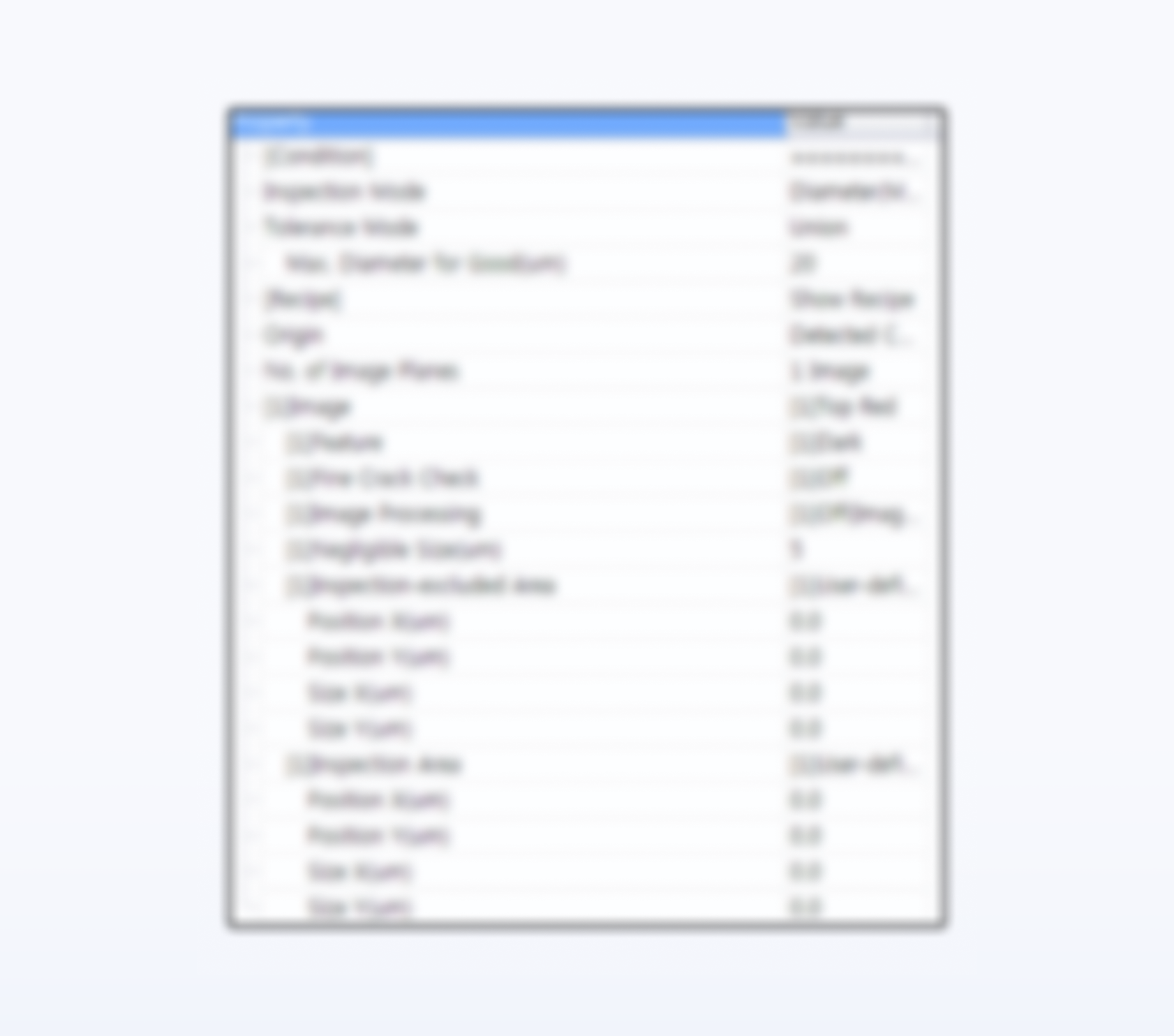
Related settings were placed in one long, unstructured list. Users could not easily understand which settings belonged together.
<Hidden Settings Menu>
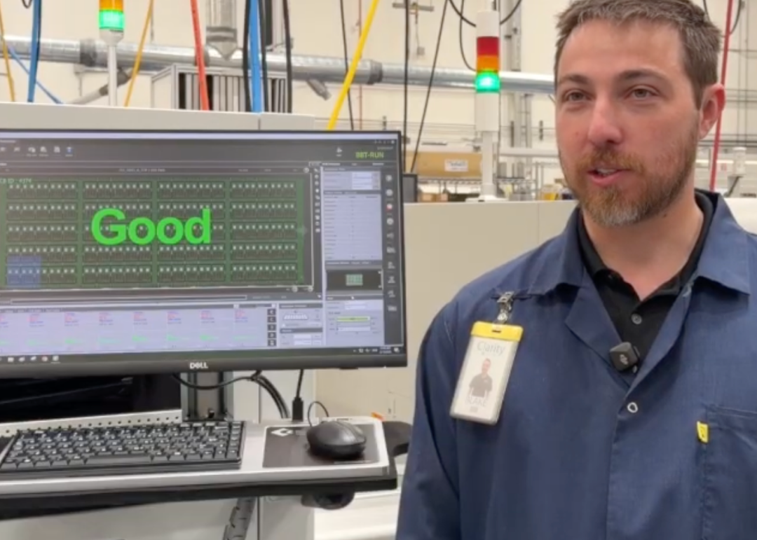
The settings menu was also easy to miss. It did not stand out from the other information on the screen
❷ Scalability Problem
<Rebuilt for Every Product>
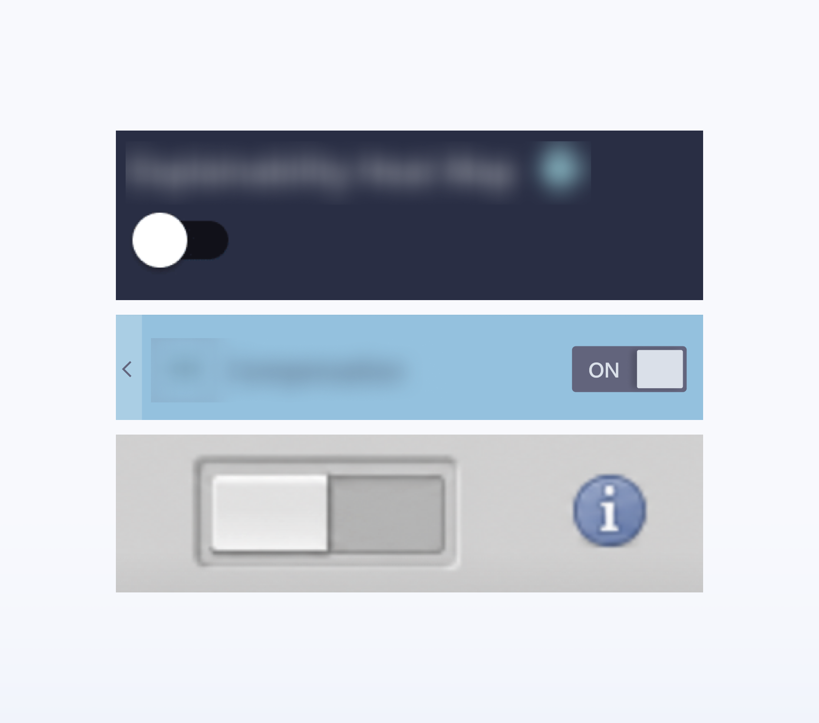
The same buttons, menus, and settings were rebuilt for every product. This created repeated design and development work.
<No Shared Figma–Unity Standard>
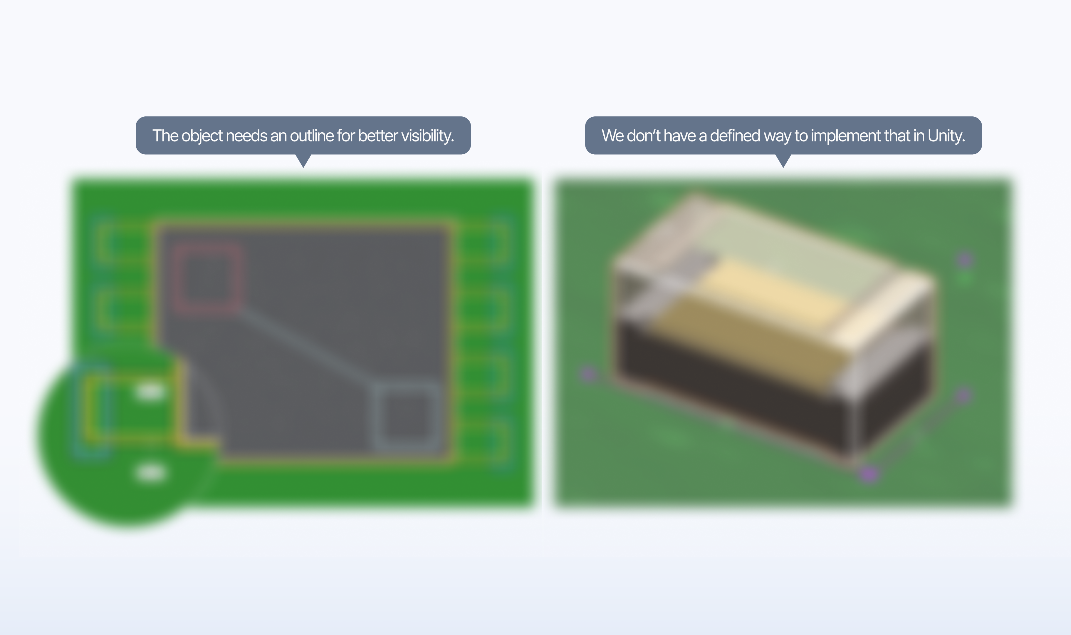
Designers and developers also used different implementation standards. For example, three pixels in Figma did not automatically create the same result in Unity. So the team had to discuss and adjust the same values repeatedly
<Rebuilt for Every Language>
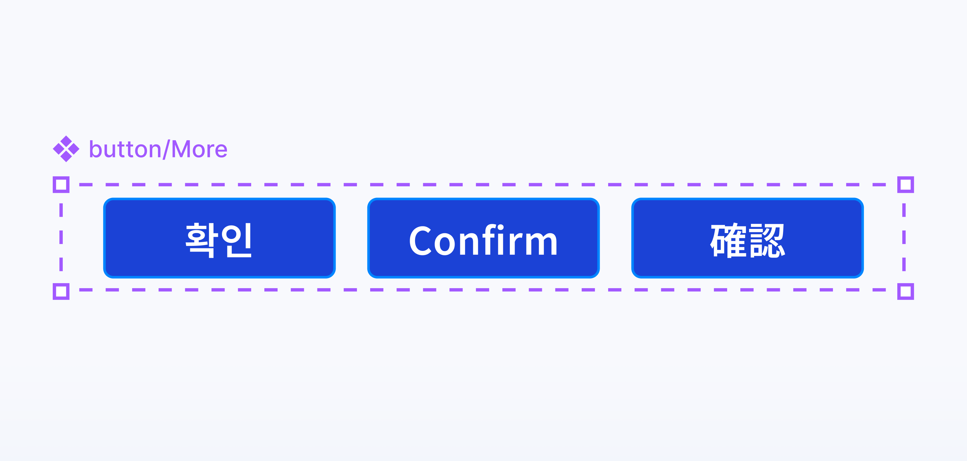
The same issue appeared in localization. We created separate component variants for Korean, English, and Japanese. Every new language increased the number of components
Solution
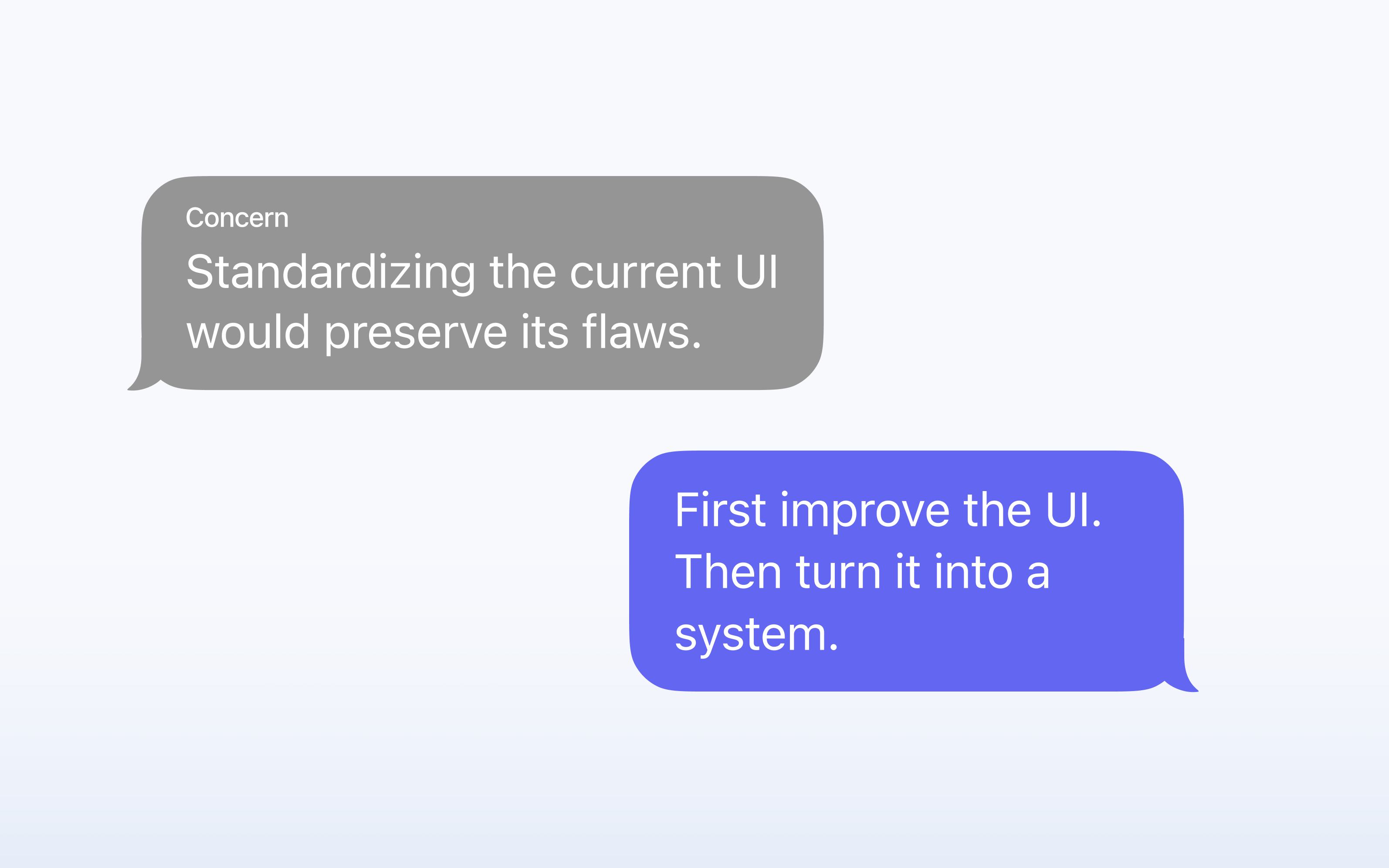
We could have started by turning the existing UI into components. But the same usability problems would remain.
So we made an important decision. First, improve the UI. Then, turn the improved patterns into a system
Solution Approach
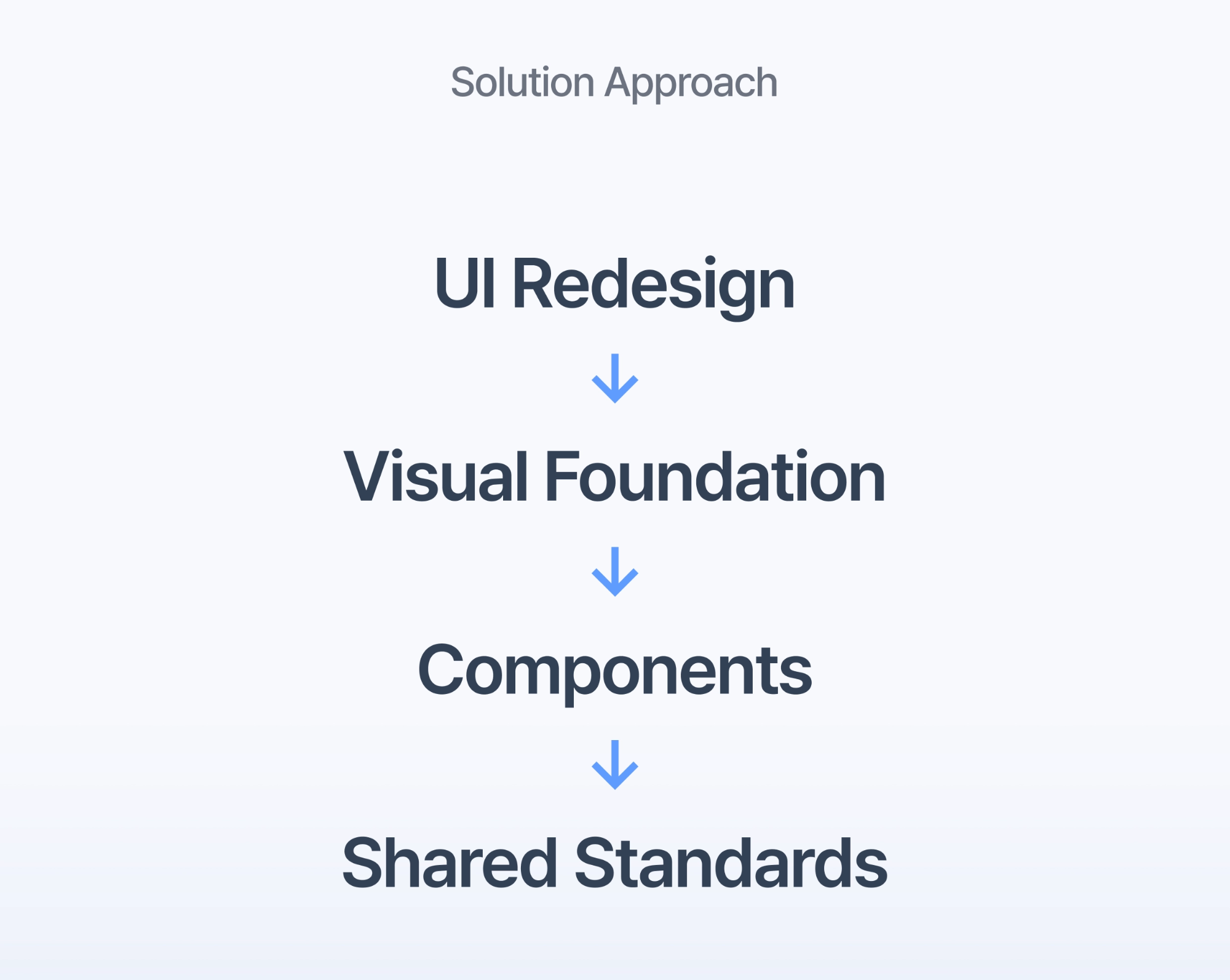
We followed four steps.
❶ UI Redesign ❷ Visual Foundation ❸ Components ❹ Shared Standards
UI redesign and visual foundation focused on the user problem. Components and shared standards focused on the team problem.
UI Redesign
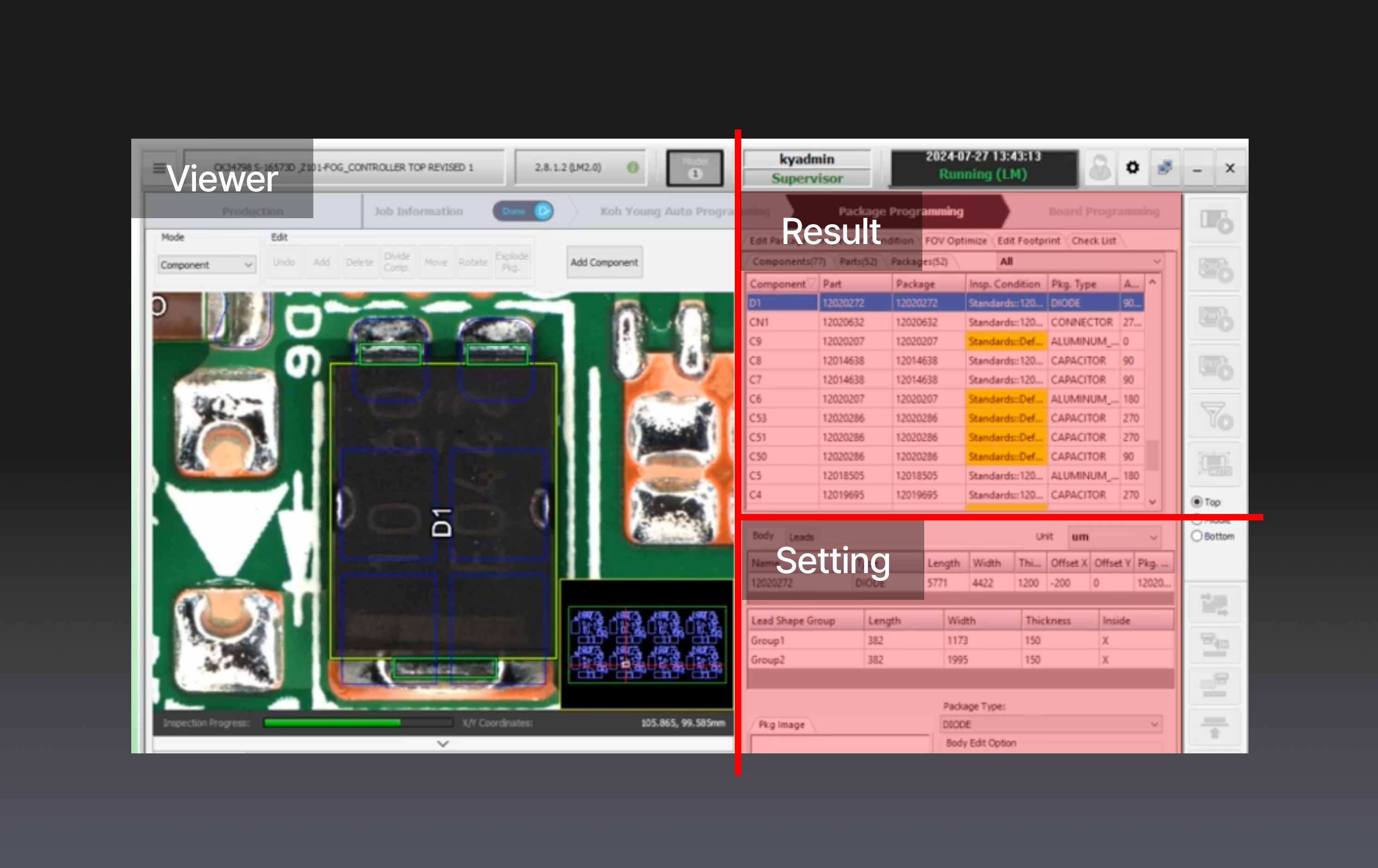
In the old UI, the viewer, results, and settings had similar visual weight. They competed for the user’s attention. Users had to search the screen to understand what was important.
❶ Clear Screen Areas
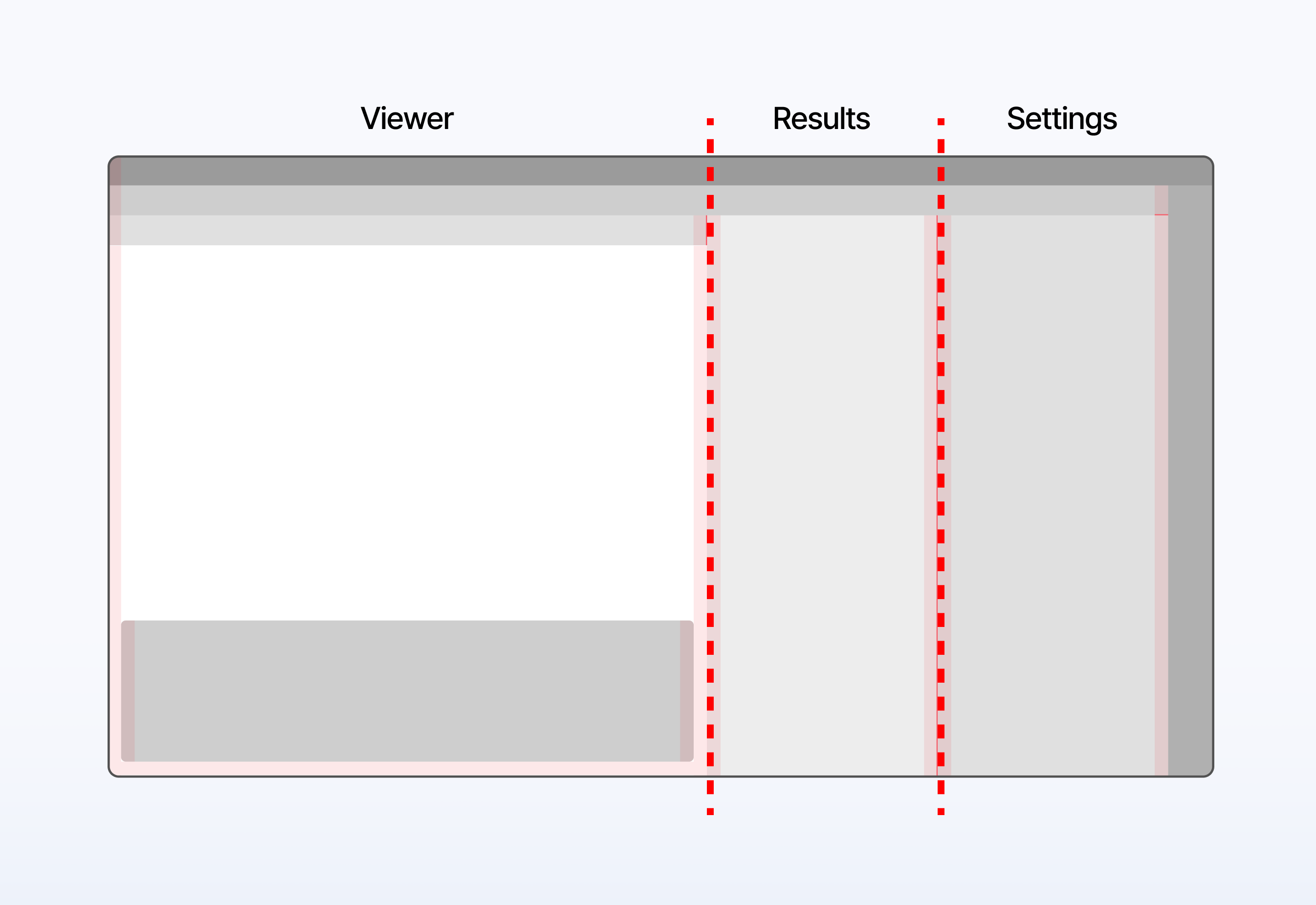
We separated the interface into three clear areas: the viewer, inspection results, and settings. Each area now had a clear role.
❷ Feature-Based Settings
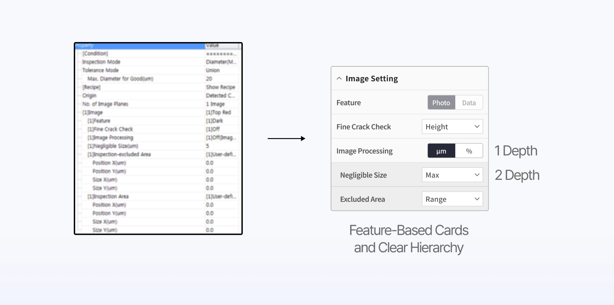
We also changed the (long settings list) into feature-based cards. Spacing, text size, and background color showed the difference between the first and second levels. This made the relationship between settings easier to understand.
❸ Redesign Output
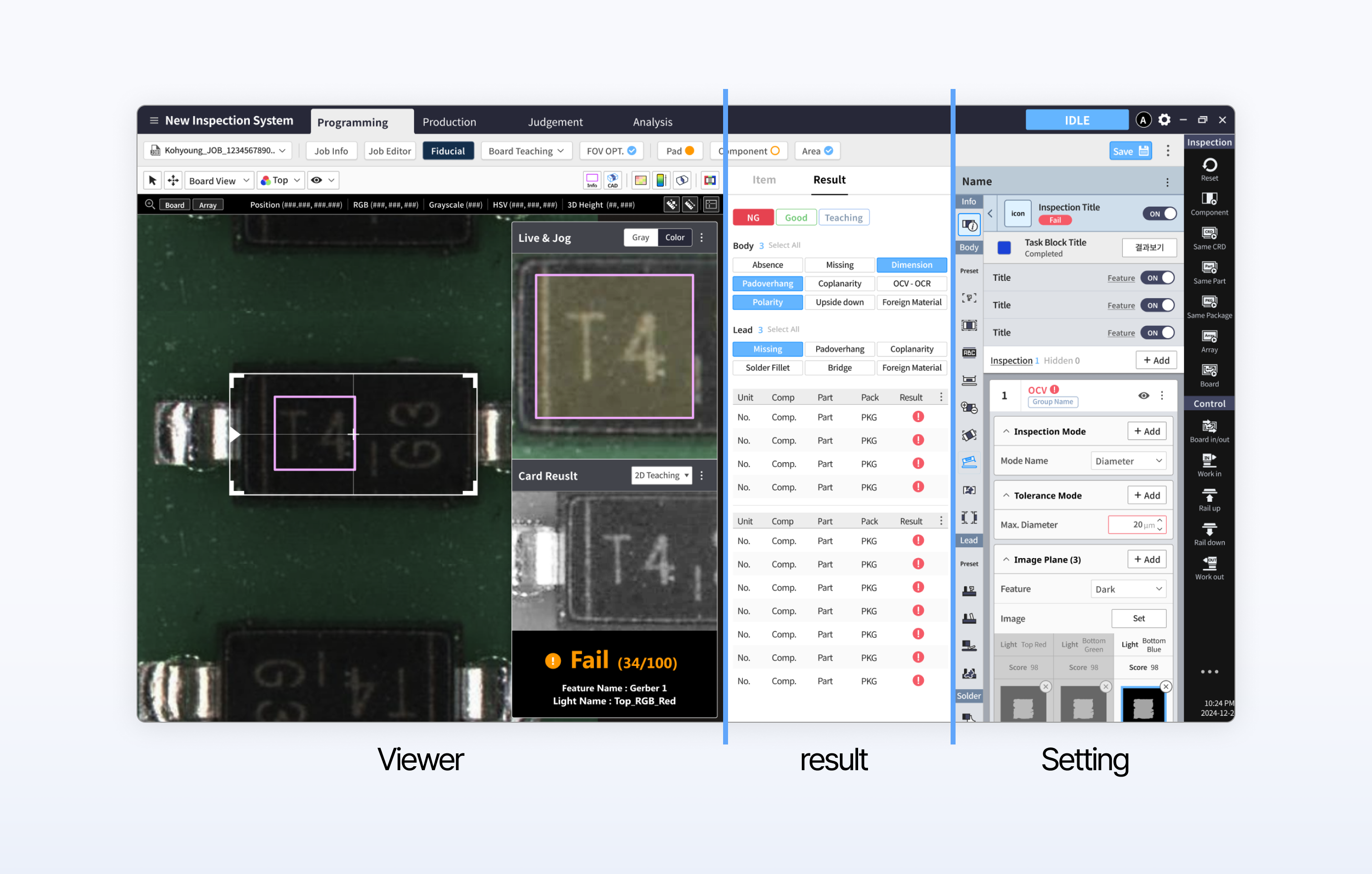
In the new UI, users could clearly see the image, the inspection result, and the related settings.
The goal was not simply to make the screen look more modern. The goal was to show information in the same order that users needed to make decisions.
Visual Foundation
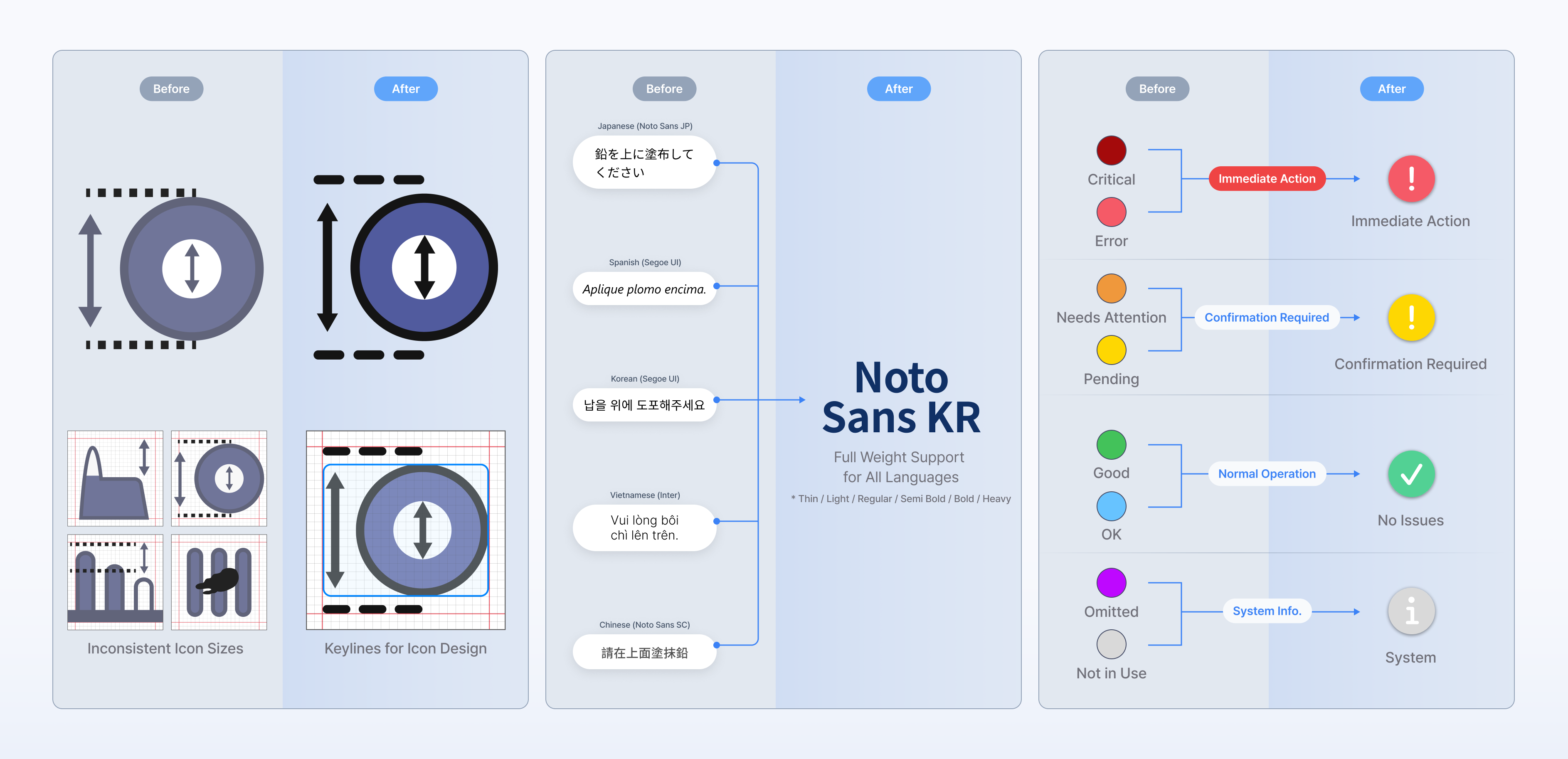
Next, we turned the UI decisions into shared visual rules.
We created consistent icon keylines and sizes. We selected a typography system that could support multiple languages.
And we organized status colors based on the action users needed to take. The purpose was to make critical information visible first
Component & Token System
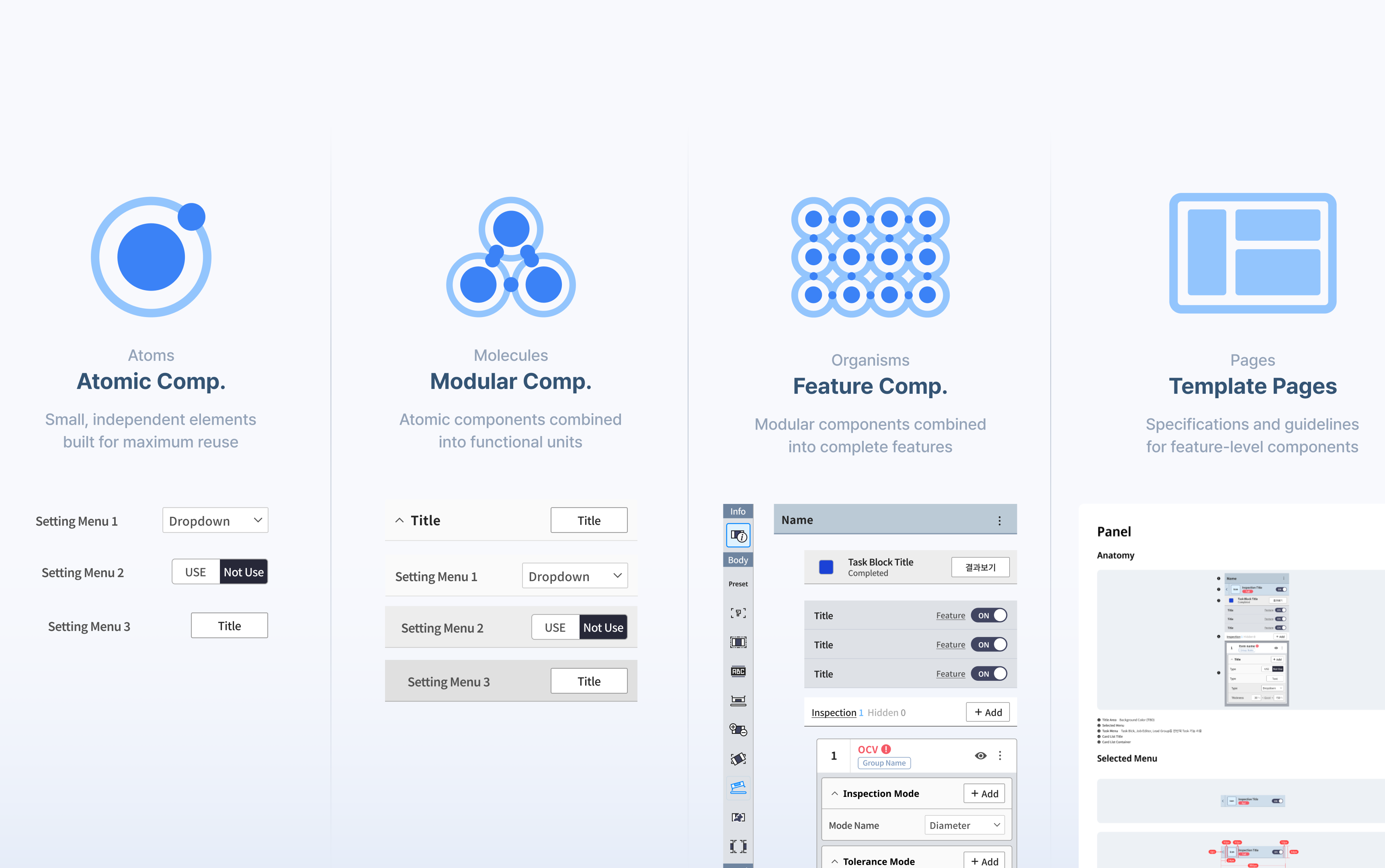
We then created a component structure with four levels: atomic components, modular components, feature components, and template pages. Atomic Design itself was not the goal. I used this structure to separate / what should be shared across every product / from what should remain product-specific. Common controls were managed at the atomic and modular levels. Product-specific functions were managed at the feature and template levels.
❶ Language Tokens
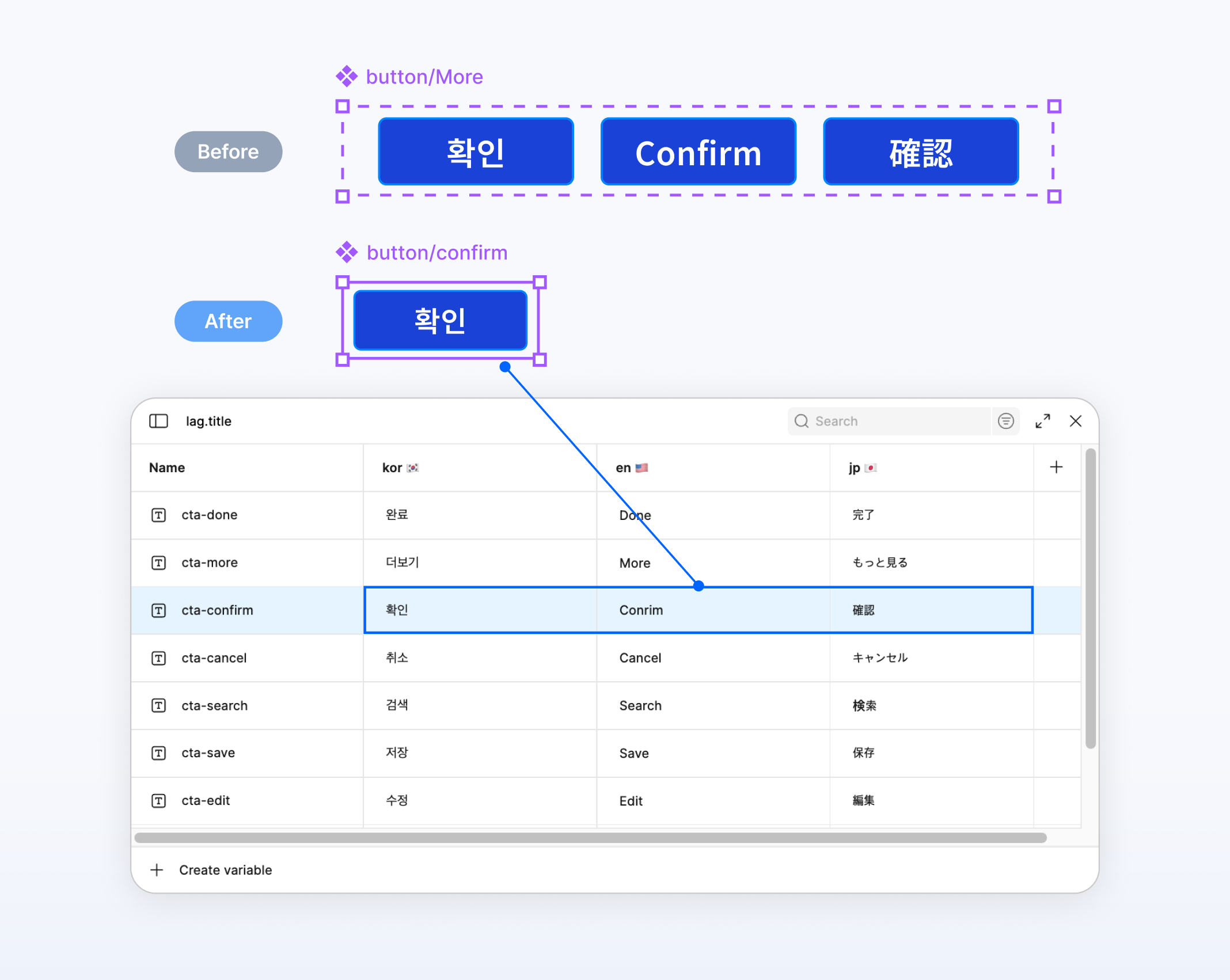
Before, each language required a separate component variant. We replaced these variants with language tokens. One component could now support multiple languages. This reduced duplication and made it easier to add a new language.
❷ Figma–Unity Standards
We could not create shared implementation values by looking only at Figma.
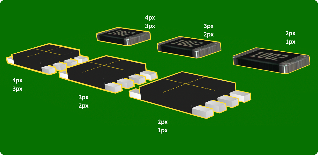
So I recreated parts of the design directly in Unity. I tested values such as outlines and corner radius to understand what could actually be built.
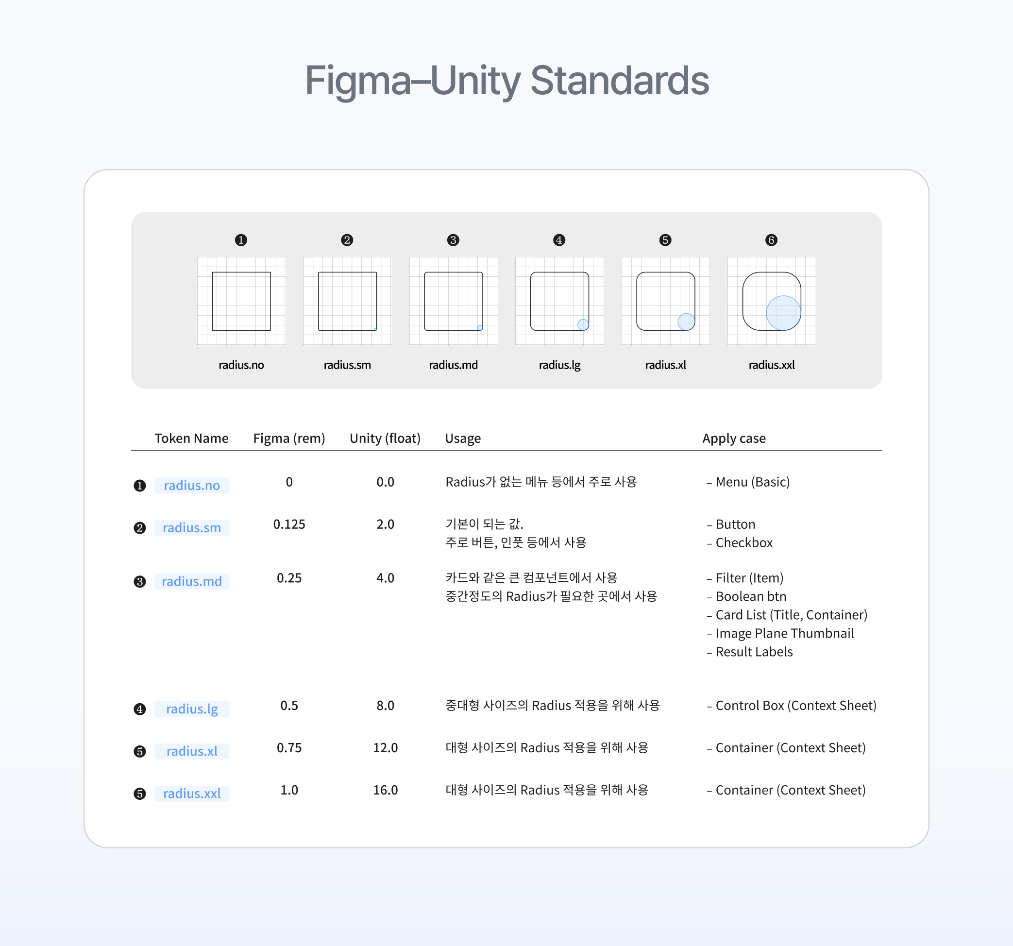
This helped us find values that worked in both environments.
Documentation
Finally, we documented all shared patterns in one design system guide
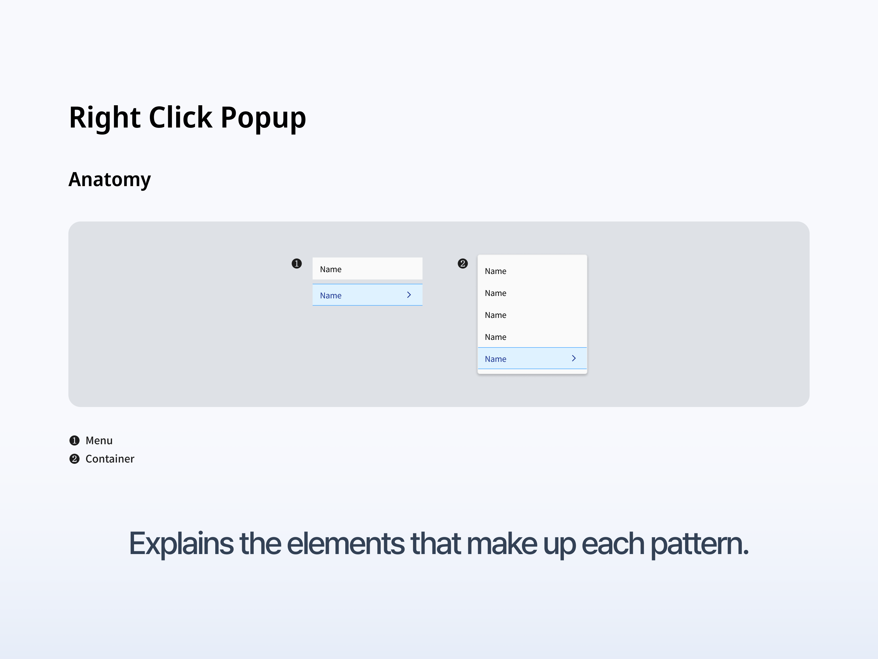
The Anatomy section explains the elements that make up each pattern.
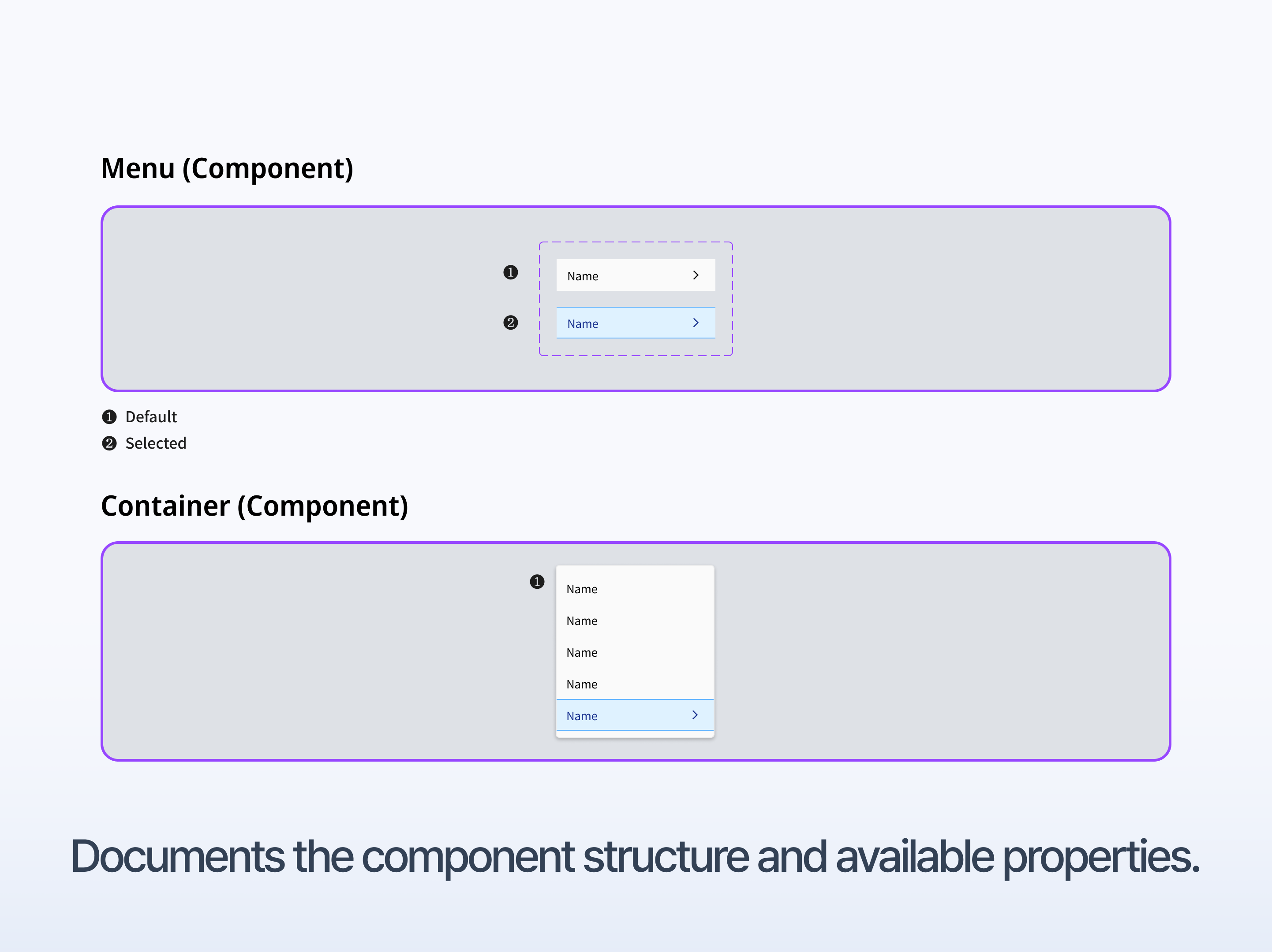
The Component section explains the structure, states, and available properties.
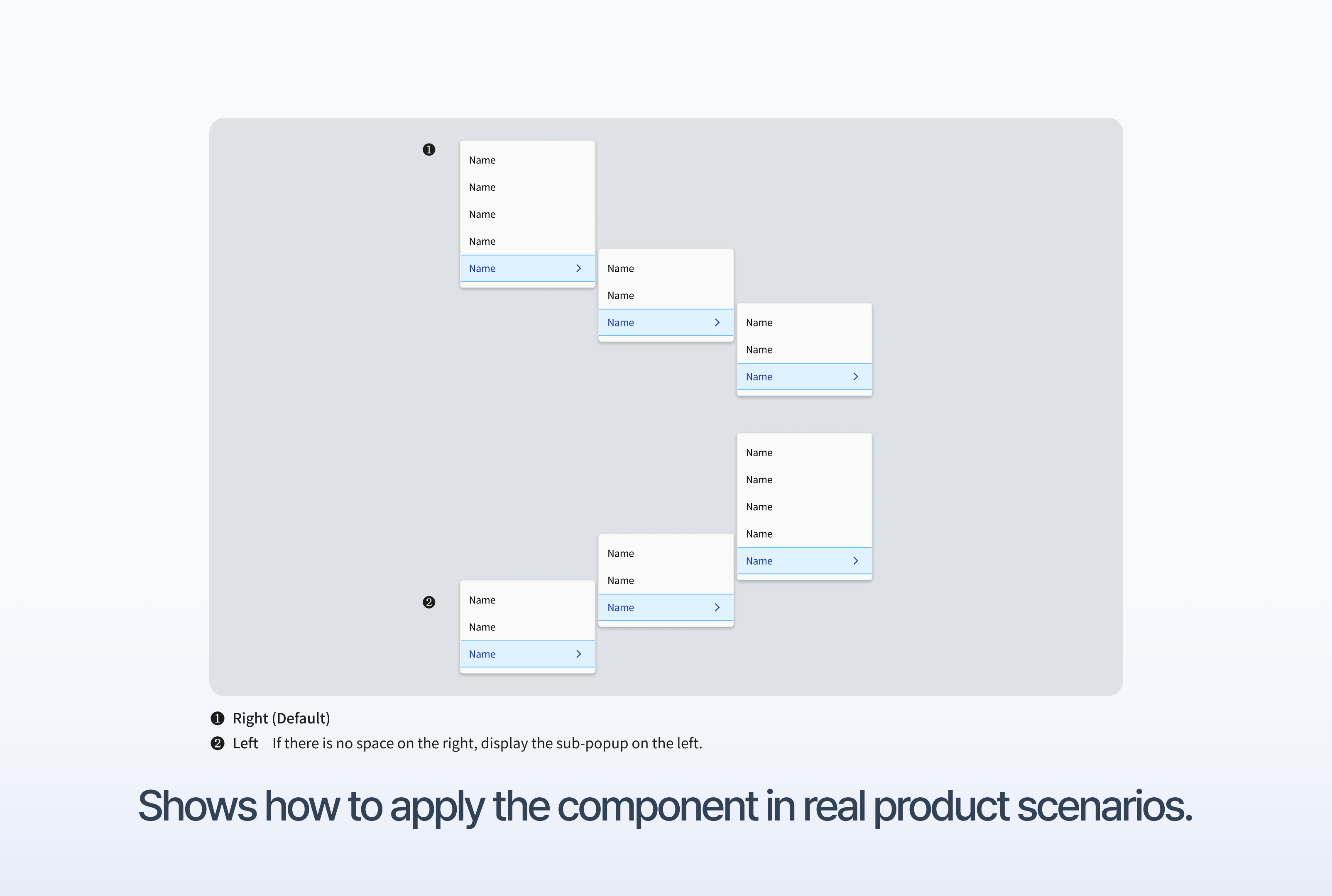
The Usage section explains how to apply the component in real product situations. It also includes special cases. For example, if there is not enough space on the right, a sub-menu should open on the left.
Impact
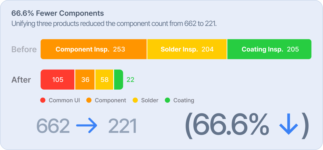
By unifying the three products, we reduced the number of components from 662


After the first design system rollout, requests from regional(리저널) designers to our team went down from 16 to 3. We also received user feedback that the redesigned lists were easier to read.

Before the design system, localization, design, UX, and development used separate standards. Teams spent too much time checking and aligning with each other.
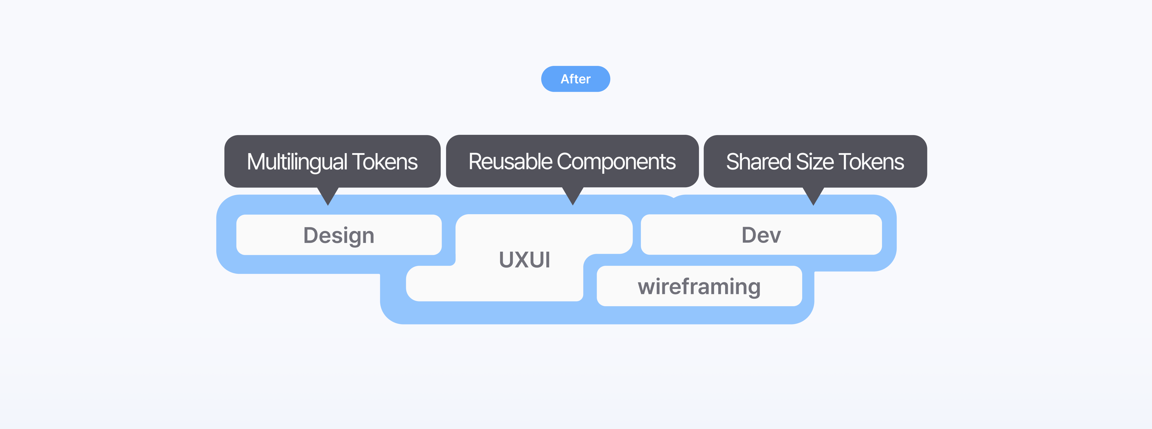
After the design system, teams could work through one shared structure. They used multilingual tokens, reusable components, and shared size values. This reduced the need to define the same rules again for every product